
7 Tips To Creating a Creative Resume

- Posted by Vijay S Paul
- Posted in Article, Learning, R10 Today
The job market in Asia-Pacific is highly competitive right now. With booming markets in India, China, Japan, South Korea, and Indonesia, to name a few, the competition for the right job is at its highest.
And in such a scenario, making the first impression might just be the turning point in how your application gets processed.
With an average recruiter spending less than 11 seconds to gain a first impression about your resume, the visual appeal of it makes a huge difference.
Today, we look at 7 tips to creating a creative resume, which might just give you an extra edge over other applicants. From changing the layout to choosing the right fonts; from eye-catching infographics to which colours to use, the following list gives you a basic idea about where to start from.
Note: While Adobe Photoshop/Illustrator/InDesign might give you the most flexibility in terms of creating a creative resume, with ample effort and expertise, there’s a lot you can do with just MS Word too!
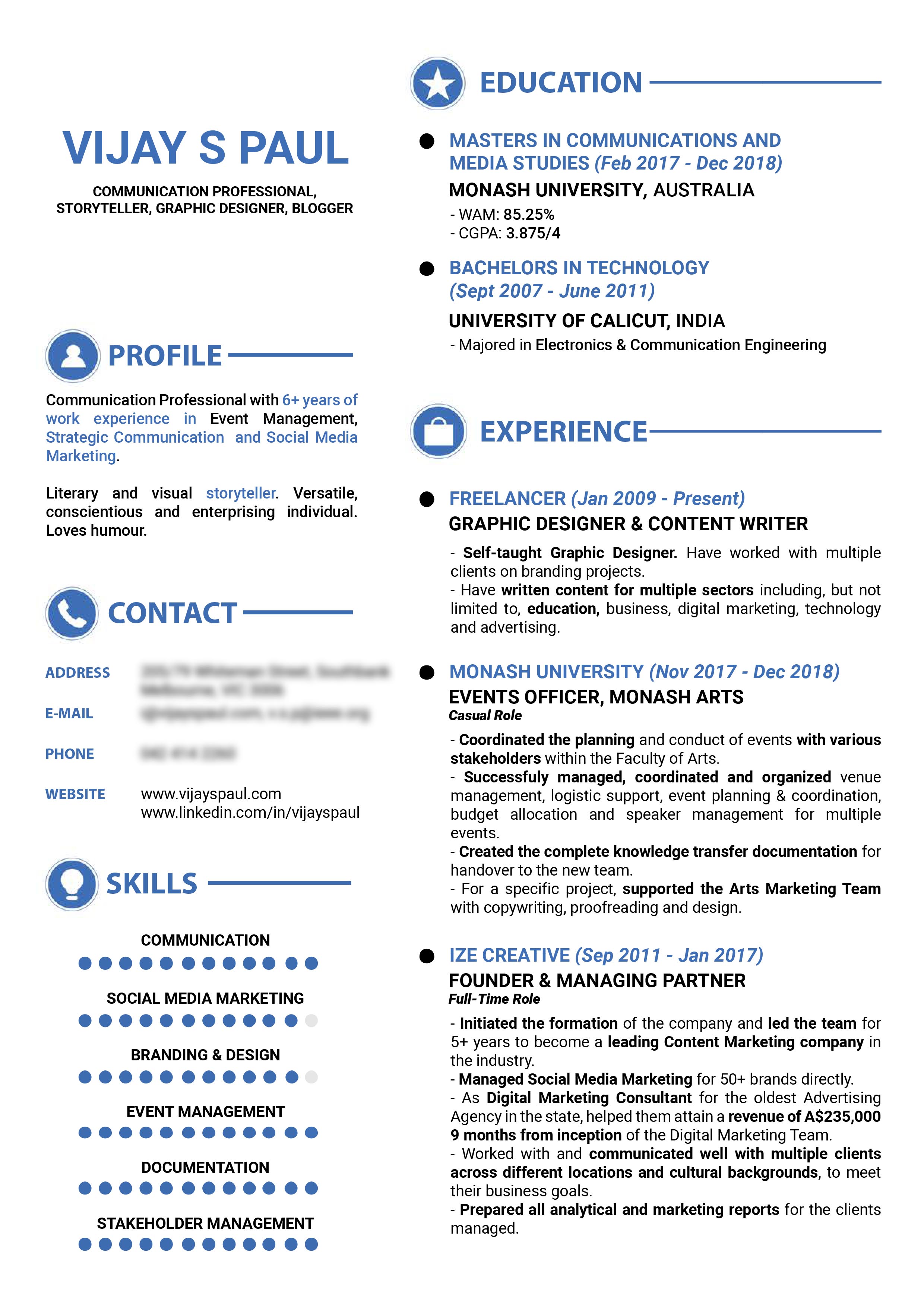
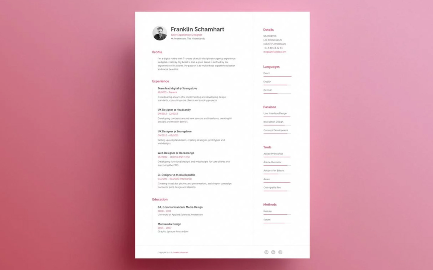
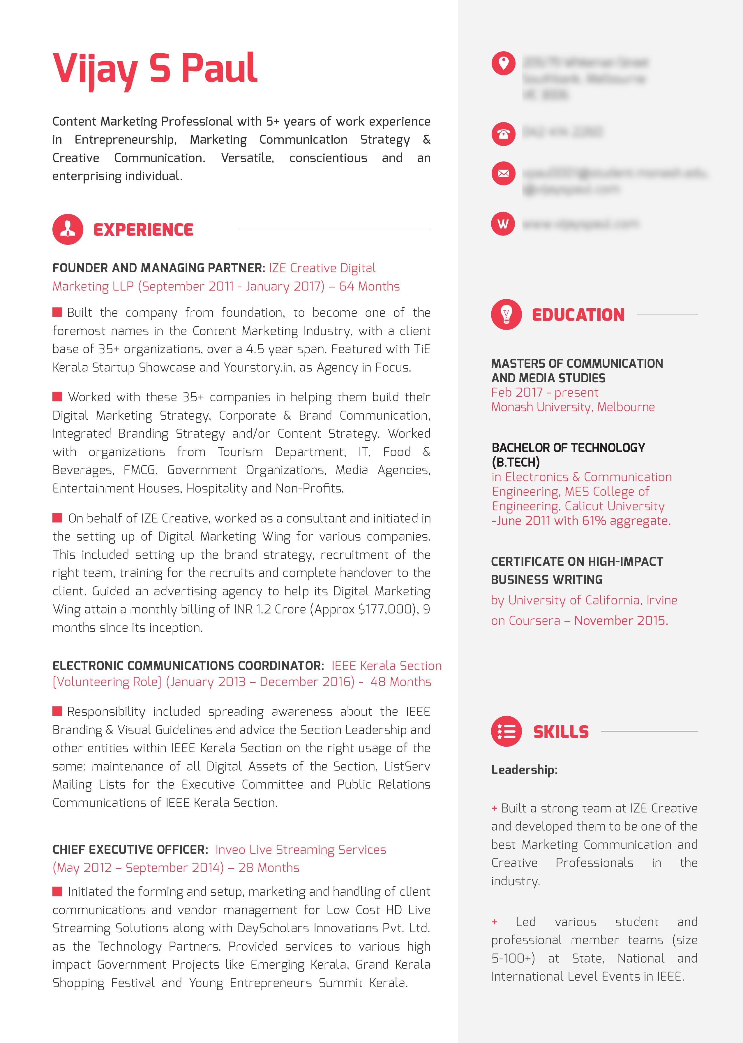
1. Use columns to increase the real estate available
When you have a lot of information to feed into your resume, it might come across as overcrowded if you do not use the real estate available judiciously. One major tip would be to split your resume page into columns: either one narrow column running on one side and a wider one with more details, or two equal width ones. The decision rests with you on how you’d want the information to be presented.

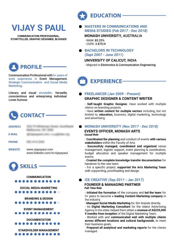
Shorter information like bio, contact details, skills etc you can place in the narrow column. Switch the background colour to make it visually separate and more catchy.
2. Leave free white spaces
No recruiter wants to come across a resume that looks like the classified page of a newspaper. One good rule of thumb would be to cut down the details to bullet points instead of complete sentences. This frees up more space and makes your resume look spacious.

Don’t lump in all the information. No one would bother to read your resume in detail until and unless you’re probably on the interview table.
3. Use infographics
Nothing catches the idea as strikingly as good design does. Instead of listing your skills or expertise in the form of boring bullet points, or even worse- as sentences, you could also go for the visual route of infographics.
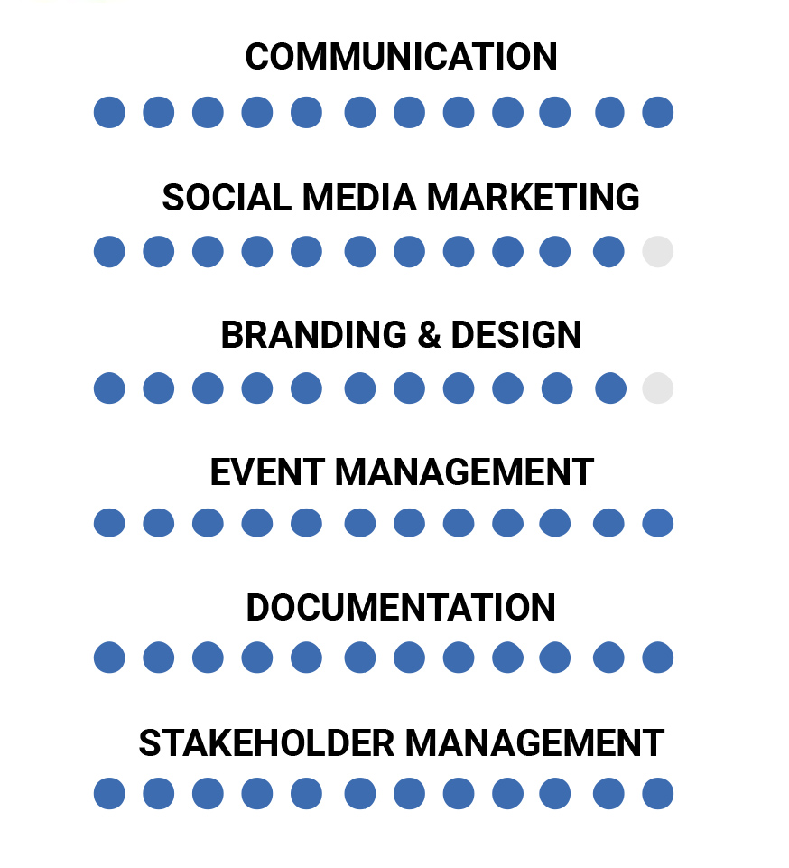
Information graphics, or infographics as they’re normally called, gives a quick understanding of the information being conveyed instead of the need to read through the content. You can use pie charts, bars, clouds, doughnut or any other type of chart design to convey the information intended.
4. Choose good fonts
Once you’ve spent so much time and effort in ensuring that your resume looks visually appealing, why would you want to spoil it in the end with the choice of awful fonts? While fonts like Calibri, Cambria, Helvetica, and Trebuchet are safe to play with as the global favourites, it wouldn’t hurt to go for some other great fonts to add the extra zing to your resume.
Next time you’re up for creating a resume, explore fonts like Roboto, Constantia, Lato or Garamond.
As for fonts to always avoid– Times New Roman (overused), Arial (overused x 2), Courier, Comic Sans, Brush Script, Impact, and Papyrus, to name a few.
5. Create a personal brand
In the present day work environment, it’s not just the creative roles that need to put in an effort in personal branding.
Every one of us has something special- we are a brand in ourselves. Highlight that and use that to your benefit. It might be something appealing as creating your own logo or just having your initials written in a classy font. Whatever the style, it helps to create a brand for you and gives a visual tag to your name.

You could just write your name in a fancy font and use it as a logo
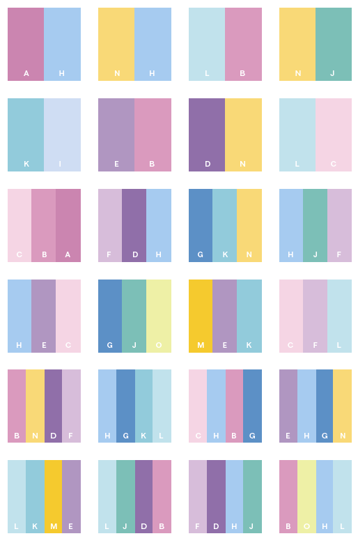
6. Use appealing colours, sensibly
While some are born with a great sense of colour, some others require years of experience to get accustomed to it. But thanks to the internet, it’s not as difficult right now to search for colour palettes and identify a good combination of colours, as it was before.
While designing a creative resume, be very mindful of the colours used. Bright colours might come across as harsh on the eyes and too many colours would make it seem like a summer project for a 7-year-old.
The safest combination would be to go with one additional colour, apart from black and white (white page, black text and coloured headings/pointers). And, if you’re real confident enough about your skills, you may even use multiple colours, as long as it’s legible and easy on the eye.
While there are a huge number of palettes available for reference online, here’s a palette we leave you with, to start off. While you may use any palette alone, feel free to choose any one of the following colours, along with the combination of white & black for your resume.

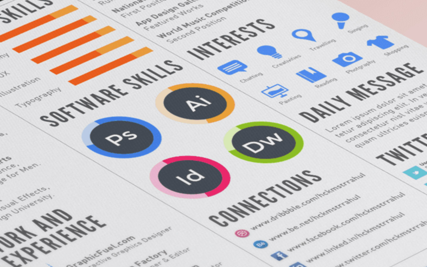
7. Use icons
While these may not be “the deal” on your resume, adding icons across the relevant section showcases the fact that you’ve gone into the minute details of making your resume look great.
At the same time, make sure that the built of the icon relates to the overall design of your resume. If the whole of your resume is single-toned and minimal, do not use detailed multi-coloured icons on your resume.
![]()
There are tons of free resources avalable for you to download free icons: Flaticon, Icons8 and The Noun Project to name a few.
Author: Vijay S Paul
Author: Vijay S Paul
Chair, 2023 IEEE R10 Information Management Committee
You must be logged in to post a comment.